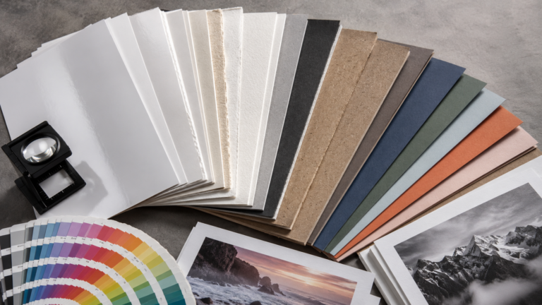
Color mode is one of the most overlooked details in print production — and one of the most expensive to get wrong. When a file is set up in the wrong color space, what looks vibrant and accurate on screen can appear dull, shifted, or off-brand once it comes off the press. Understanding CMYK vs. RGB for print explained is the single most important technical step you can take before sending any file to a print shop.
At Replica Printing in Poway, California, we’ve been helping San Diego businesses, designers, and marketing teams produce professional printed materials for nearly two decades. File setup issues — especially color mode mismatches — are consistently among the top reasons a print job doesn’t turn out as expected. This guide explains exactly what CMYK and RGB are, how they differ, and how to make sure your files are set up correctly from the start.
CMYK Is the Standard Color Mode for All Professional Print Projects
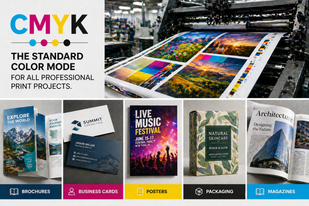
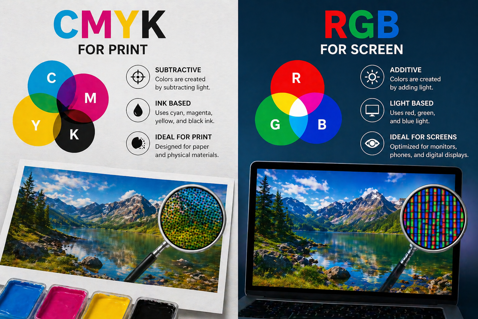
CMYK stands for Cyan, Magenta, Yellow, and Key (Black). It is the color model used by virtually every professional printing press and digital printer in the world — including the equipment we use at Replica Printing. Instead of producing color through light, CMYK works by layering semi-transparent inks onto paper. Each ink absorbs certain wavelengths of light, and the combination of those four channels creates the full spectrum of printable color.
How CMYK Ink Mixing Creates Color on Paper
In CMYK printing, color is built by controlling the percentage of each ink deposited onto the substrate. A value of 0% means no ink of that color; 100% means full saturation. Here’s how the four channels work:
- Cyan (C) — A blue-green ink that absorbs red light wavelengths
- Magenta (M) — A red-pink ink that absorbs green light wavelengths
- Yellow (Y) — Absorbs blue light and contributes warmth to mid-tones
- Key/Black (K) — Deepens shadows, sharpens text, and reduces the total ink load needed
Because CMYK builds color by subtracting light rather than adding it, it operates within a narrower color range — called a gamut — than what your monitor can display. This difference is the root cause of most color-matching frustrations between screen and print.
RGB Is Designed for Screens, Not Printed Materials
RGB stands for Red, Green, and Blue — the three primary colors of light. Every digital display you interact with, from your phone to your desktop monitor, creates color by emitting varying intensities of these three light sources. RGB is an additive color model: combine all three at full intensity and you get pure white light; dial all three to zero and you get black.
Why RGB Colors Appear Brighter Than Their Printed Equivalents
RGB displays have a significantly wider color gamut than CMYK printing. Screens can produce luminous neons, electric blues, and saturated greens that physical inks simply cannot replicate. A logo that glows on your monitor may appear noticeably flatter when printed — not because something went wrong with the printer, but because those colors fall outside what ink on paper can physically achieve.
- Use RGB for: websites, social media graphics, digital ads, email headers, slide decks, and any content viewed on a screen
- Avoid RGB for: business cards, brochures, flyers, workbooks, posters, banners, direct mail pieces, or any material that will be physically printed
What Happens When You Send an RGB File to Print?
When an RGB file arrives at a print shop without being converted to CMYK, one of two things happens: the printer’s raster image processor (RIP) auto-converts the file using a generic color profile, or the job is printed with unpredictable results. Neither outcome is ideal, and both can lead to wasted materials, costly reprints, and missed deadlines.
Common problems caused by printing RGB files include:
- Washed-out or dull colors — Vivid screen colors lose saturation when forced into the narrower CMYK gamut
- Unexpected color shifts — Blues can shift toward purple, bright greens can turn olive, and some reds can appear orange
- Inconsistent results across print runs — Different RIPs handle RGB-to-CMYK conversion differently, so the same file can print slightly differently each time
- Loss of brand color accuracy — Auto-conversion won’t respect your specific Pantone or hex values, leading to off-brand output
- Blurry or heavy black text — An RGB black value (0, 0, 0) auto-converts to a four-color black, which can cause ink spread and soft edges on body text
At Replica Printing, our team reviews every file before it goes to press. If we spot an RGB document where CMYK is required, we’ll flag it — but the cleanest results always come from files set up in the correct color space from the very beginning.
CMYK vs. RGB: Key Differences Side by Side
Here is a quick reference comparison of the two color models to help you choose the right one for your project:
| Feature | CMYK | RGB |
|---|---|---|
| Color model type | Subtractive (ink on paper) | Additive (light on screen) |
| Channels | Cyan, Magenta, Yellow, Black | Red, Green, Blue |
| Best used for | All professional print materials | Digital and screen-based media |
| Color gamut | Narrower — limited by ink physics | Wider — full visible light spectrum |
| White value | 0% of all inks (paper shows through) | 255, 255, 255 (all light channels at max) |
| Black value | 100% K (or rich black ink blend) | 0, 0, 0 (all light channels off) |
| Recommended file formats | PDF/X-1a, PDF/X-4, AI, EPS, TIFF | PNG, JPEG, GIF, WebP, SVG |
When Should You Convert Your Files to CMYK Before Printing?
The short answer: always convert to CMYK before sending any file to print. That said, there are specific project types where getting this right is especially critical — and where the cost of a color mismatch is highest:
- Brand identity materials — Business cards, letterheads, and branded collateral need consistent, accurate color across every print run to protect your brand image
- Sales and marketing materials — Brochures, sell sheets, and flyers are high-visibility pieces; off-color printing signals a lack of professionalism to your prospects
- Training and education materials — Workbooks, course binders, and instructional manuals often use color-coded charts and diagrams where accuracy is functional, not just decorative
- Large-format reprographics — Posters, banners, and architectural plans printed at scale make any color shift far more visible and distracting
- Direct mail campaigns — Color consistency across a large mail run depends entirely on correct file setup upfront
How to Set Up Your Print Files in CMYK the Right Way
Setting up files correctly in CMYK from the beginning is the most reliable way to ensure your printed piece matches your design intent. Follow these six steps before submitting files to any print shop:
- Start your document in CMYK mode — In Adobe InDesign, Illustrator, or Photoshop, set the document color mode to CMYK before you begin. Switching after the fact can introduce unwanted color shifts.
- Apply the correct CMYK color profile — For most U.S. print projects, U.S. Web Coated (SWOP) v2 is the standard profile. If your print shop has a preferred house profile, request it before you start designing.
- Convert all placed images to CMYK — Photos and logos sourced from the web are almost always RGB. Open each image in Photoshop and convert it to CMYK before placing it into your layout.
- Use the right black for the right situation — For body text, use 100% K only. For large dark backgrounds or bold graphic shapes, use a rich black blend (C: 60, M: 40, Y: 40, K: 100) for a deeper, more even result.
- Request a printed proof before your full run — A physical proof lets you see actual printed color, not a screen preview. At Replica Printing, we offer free printed proofs so you can approve color accuracy before your job goes to press.
- Export as a press-ready PDF — Use PDF/X-1a or PDF/X-4 when exporting from your design software, and confirm in the export settings that output is set to CMYK with all fonts embedded and images at a minimum of 300 DPI.
Frequently Asked Questions About CMYK vs. RGB for Print
Can I send a PNG file to a print shop?
PNG files are typically saved in RGB and are intended for screen use. While some print shops can accept PNGs for basic jobs, they rarely produce optimal results for professional print projects. For best quality, export your artwork as a CMYK PDF before submitting it to any print shop.
Why does my printed brochure look different from my screen?
The difference almost always comes down to the RGB-to-CMYK gamut gap. Screens use light to produce color and can display a far wider range of hues than ink on paper can reproduce. To minimize this difference, design in CMYK from the start and always request a physical proof before approving a full print run.
What is rich black, and when should I use it?
Rich black is a CMYK ink blend — typically C: 60, M: 40, Y: 40, K: 100 — that creates a deeper, more saturated black than 100% K alone. It’s ideal for large dark backgrounds and bold graphic areas. It should never be used for small body text, where the layered ink coverage can cause misregistration and blurry edges.
Does it matter which software I use to design for print?
Adobe InDesign, Illustrator, and Photoshop are the industry standard for professional print design because they all support CMYK mode and precise color profiles. Web-based tools like Canva default to RGB and may require file conversion before the output is truly print-ready. Replica Printing’s team reviews every file submitted and can advise on any adjustments needed.
What file format does Replica Printing prefer for print jobs?
We recommend press-ready PDFs — PDF/X-1a or PDF/X-4 — with all fonts embedded and images set to CMYK at 300 DPI minimum. For logo-heavy or vector artwork files, we also accept AI and EPS formats. Every file is reviewed by our team before printing begins, and our file upload portal makes submission straightforward.
What CMYK color profile should I use for professional printing?
For most commercial print jobs in the United States, U.S. Web Coated (SWOP) v2 is the standard CMYK color profile built into Adobe Creative Cloud applications. If your print shop uses a specific in-house profile, always request it before you start your project. The Replica Printing team is happy to advise on the right profile for your specific job type and substrate.
Getting your color mode right before you print is one of the simplest ways to protect the quality of your materials — and it’s a step that prevents expensive reprints. At Replica Printing, we work closely with San Diego businesses and designers to make sure every file is press-ready before it ever reaches the press. Whether you need guidance on file setup, a free printed proof, or a full production run with fast local turnaround, our team is ready to help you get it right the first time.
Ready to print with confidence? Contact Replica Printing or request a quote today — and let our team make sure your colors look exactly right on press.